ggplot
1 Creating graphs
Artwork by @allison_horst
1.1 Making graphs with ggplot2
Set up
We will use the palmer penguin data to make graphs.
How to open a saved Rproj and read in data if not already open
Open your saved Rproj in Rstudio by clicking File menu then Open project and look for your .Rproj file. Click the Files tab in the bottom right pane, click the data folder and check the penguins.csv is in there. Then read it in.
penguins <- read.csv(file = "data/penguins.csv")There are different plotting systems in R for example, the base plotting
system. But the function ggplot in the ggplot2
package is used by the majority of people.
To use it you will need to ensure you have the ggplot2 package
installed. Hint: you could use the Packages tab, bottom right and then
load it using the function library().
library(ggplot2)
ggplot2 is built on the idea that any plot can be made from the same set of components: a data set, a mapping, and some geoms.
The key to understanding ggplot2 is to think about a graph in layers.
Let’s start off with an example:
ggplot(data = penguins, mapping = aes(x = body_mass_g, y = flipper_length_mm)) +
  geom_point()
In the command we call the ggplot function. Any of the
arguments we give the ggplot function in the brackets
following, will apply to all layers on the plot.
We’ve passed in two arguments to ggplot. First, we tell
ggplot what data we want to use to make the figure. In this
example, that is the penguins data we read in earlier.
For the second argument called mapping, we passed in the
aes function, which tells ggplot how variables
in the data map to aesthetic
properties of the figure. In this case the x and
y locations. Here we told ggplot we want
to plot the “body mass” column of the penguins data frame on the x-axis,
and the “flipper length” column on the y-axis.
By itself, the call to ggplot isn’t enough to draw a
figure:
ggplot(data = penguins, mapping = aes(x = body_mass_g, y = flipper_length_mm))We need to tell ggplot how we want to visually represent
the data, which we do by adding a geom layer. In our
example, we used geom_point, which tells
ggplot we want to visually represent the relationship
between x and y as a scatterplot of
points:
ggplot(data = penguins, mapping = aes(x = body_mass_g, y = flipper_length_mm)) +
  geom_point()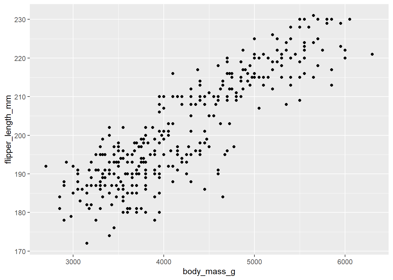
Challenge 1
Modify the example so that the figure shows how bill length relates to flipper length:
ggplot(data = penguins, mapping = aes(x = body_mass_g, y = flipper_length_mm)) +
    geom_point()
Solution to Challenge 1
Here is one possible solution:
ggplot(data = penguins, mapping = aes(x = bill_length_mm, y = flipper_length_mm)) +
  geom_point()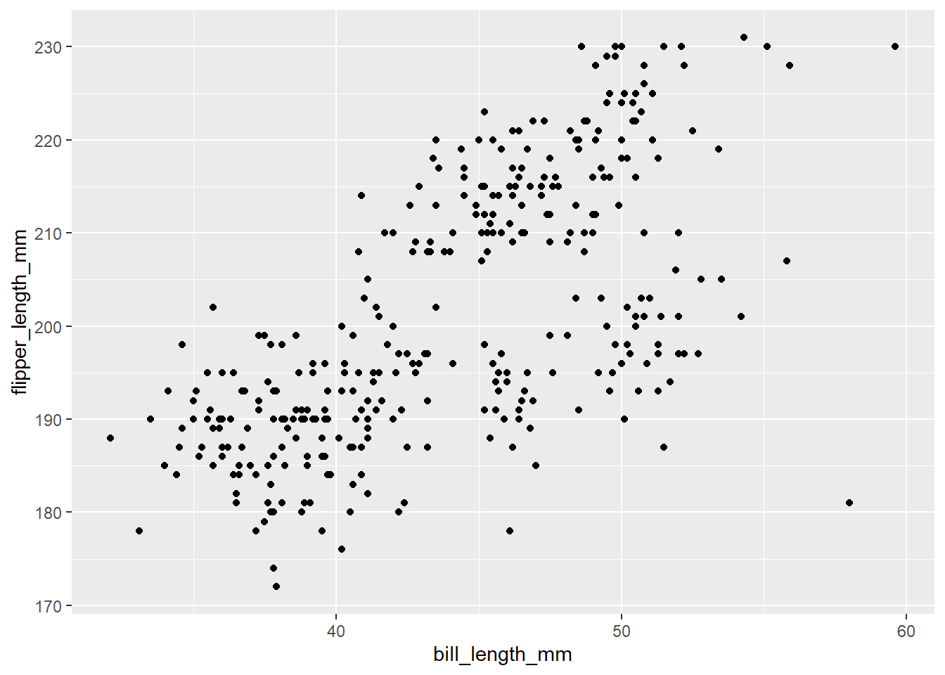
Note: we can add arguments to geom_point to control the size, transparency and shape of the points.
ggplot(data = penguins, mapping = aes(x = bill_length_mm, y = flipper_length_mm)) +
  geom_point(size = 5, alpha = 0.5, shape = "diamond")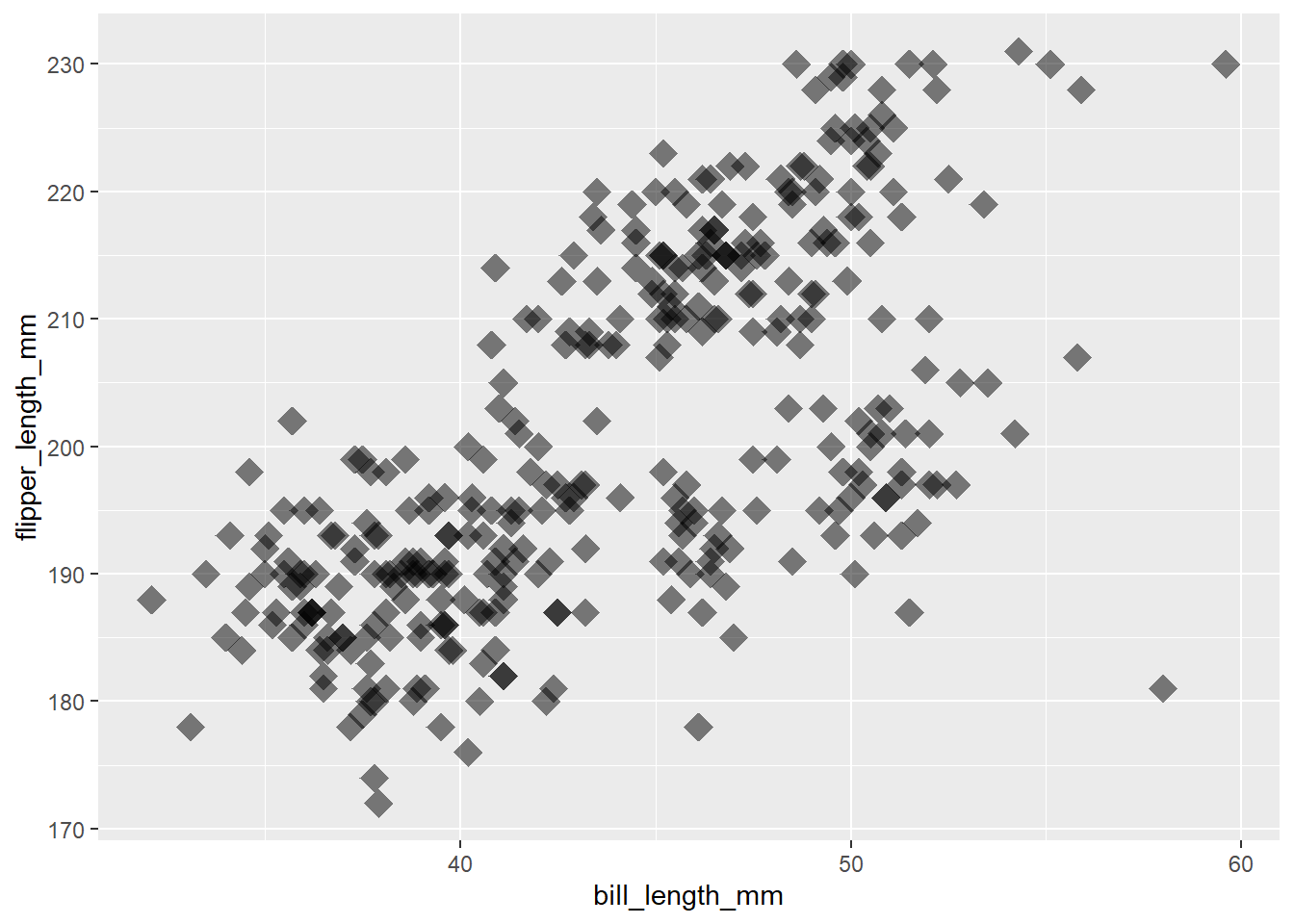
Challenge 2
So far we’ve used the
aesfunction to tell the scatterplot geom about the x and y locations of each point. Another aesthetic property we can modify is colour. Add acolour=argument to the aes brackets to colour the points according to the “species” column.
Solution to Challenge 2
Here is one possible solution:
ggplot(data = penguins, mapping = aes(x = bill_length_mm, y = flipper_length_mm, colour = species)) +
  geom_point()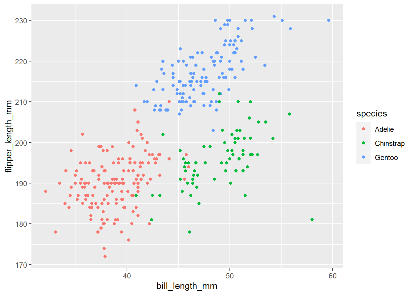
We can make other types of graph using other geoms.
If we wanted to compare body mass among the penguin species we might use
a boxplot. We can change the geom to do this:
ggplot(data = penguins, mapping = aes(x = species, y = body_mass_g)) +
  geom_boxplot()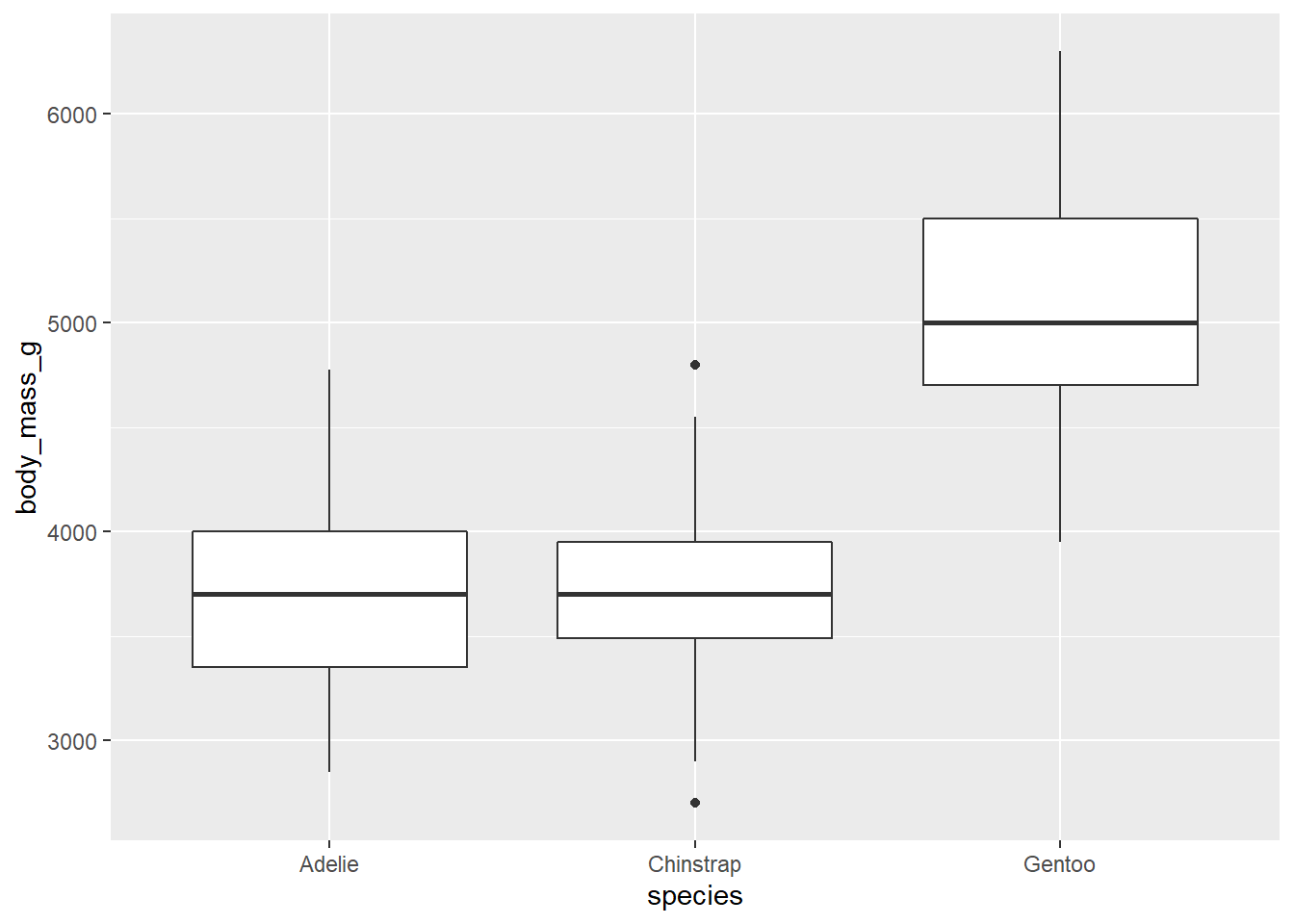
Tip: ggplot cheat sheet
There is a ggplot cheat sheet to download which you can look at to see what the geoms are for common types of graph, as well as other ggplot code.
Note that the layers on the cheat sheet have single letters and a + to represent the rest of the code for the graph.
1.2 Layers
If we want boxplots with data points on top to visualise the spread
of the data, we can add another layer to the plot.
geom_jitter() is good for this because it does not plot the
points in one vertical line but randomly spreads them out:
ggplot(data = penguins, mapping = aes(x = species, y = body_mass_g)) +
  geom_boxplot() +
  geom_jitter()
More layers can be added to control the way a graph looks. For example, we can change the axes labels:
ggplot(data = penguins, mapping = aes(x = species, y = body_mass_g)) +
  geom_boxplot() +
  geom_jitter() +
  labs(x = "Species",
       y = "Body Mass (g)")
We could use lots of layers to control the background, gridlines,
axis lines. However, using a theme instead does this in one layer.
theme_classic() gives styling that might be found in a
scientific journal.
ggplot(data = penguins, mapping = aes(x = species, y = body_mass_g)) +
  geom_boxplot() +
  geom_jitter() +
  labs(x = "Species",
       y = "Body Mass (g)") +
  theme_classic()
Challenge 3
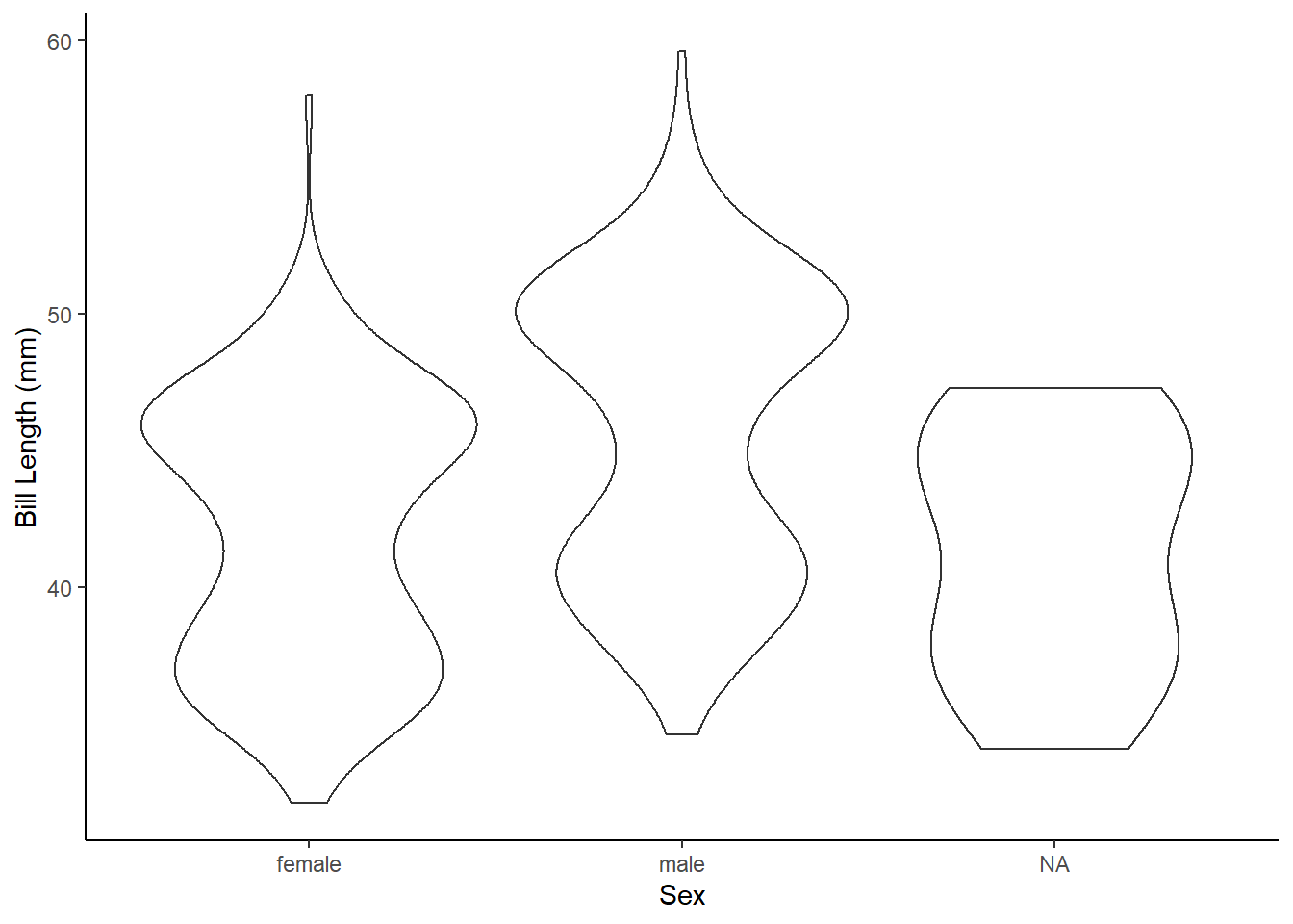
Create a ggplot graph using the
geom_violin()which shows the difference in bill length among the sexes. Add layers for axes labels and theme styling.
What the Challenge 3 graph might look like
1.3 Colour
We previously used colour in aes to give each species a different colour:
ggplot(data = penguins, mapping = aes(x = bill_length_mm, y = flipper_length_mm, colour = species)) +
  geom_point()
Putting the colour = species in the aes function in the
geom layer also works:
ggplot(data = penguins, mapping = aes(x = bill_length_mm, y = flipper_length_mm)) +
  geom_point(aes(colour = species))
However, if we want to specify that all points should be a blue
colour, oppose to levels in a variable being different colours, we use
colour = but outside of the
aes brackets:
ggplot(data = penguins, mapping = aes(x = bill_length_mm, y = flipper_length_mm)) +
  geom_point(colour = "blue")
Note the word blue is put in “speech marks”.
Challenge 4
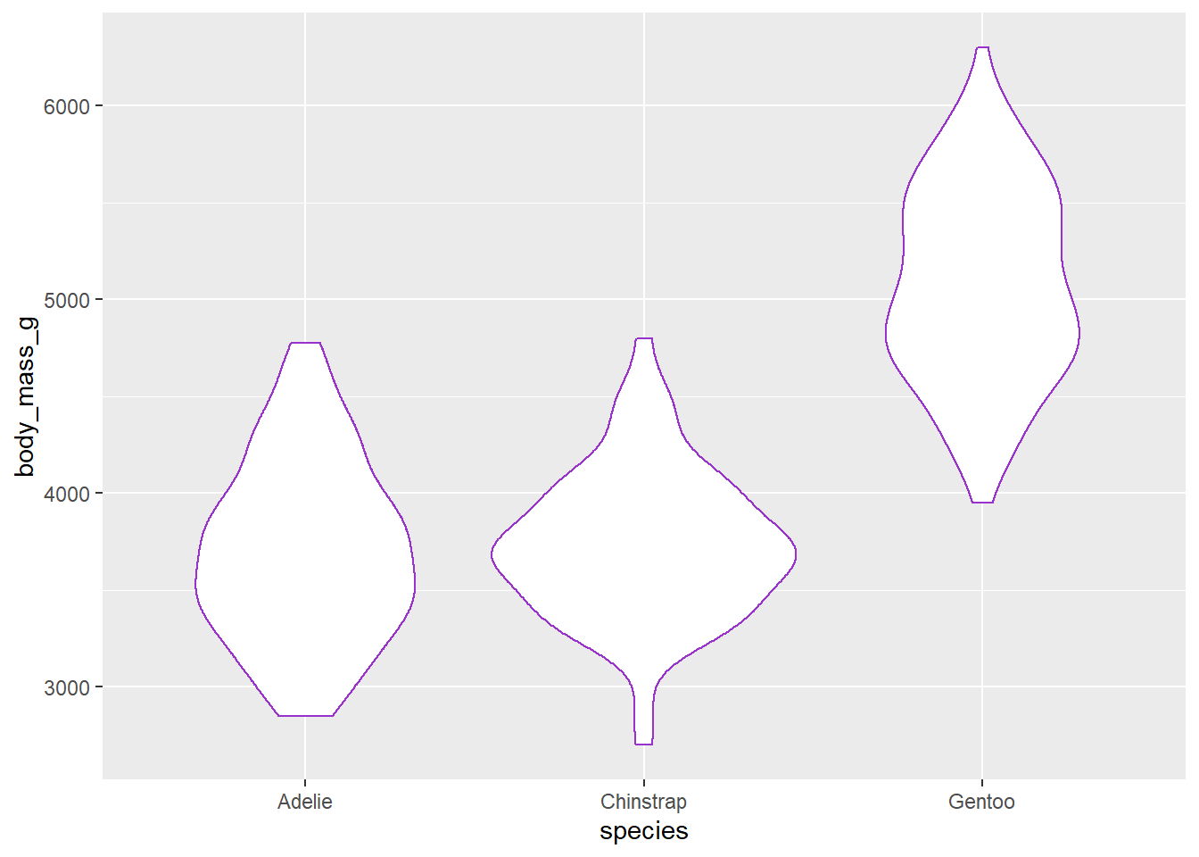
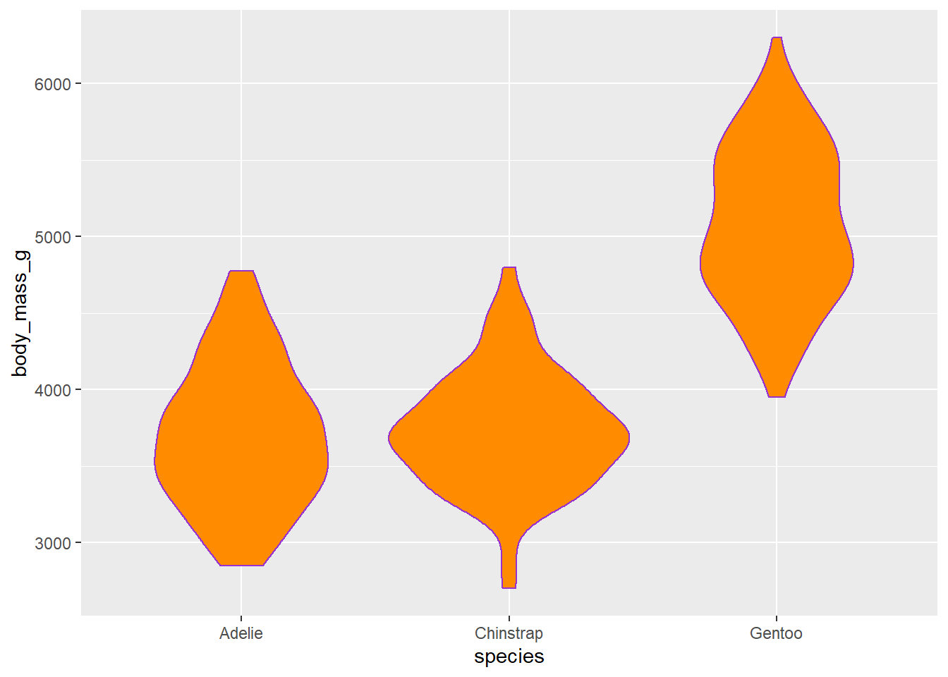
Choose a colour from this website that lists R colours and create a violin plot outlined in that colour which shows the difference in body mass among species. You can include layers for axes labels and styling.
What the Challenge 4 graph might look like
fill = "darkorange" will add a colour to the
inside of the violin.
This graph uses default colours:
ggplot(data = penguins, mapping = aes(x = bill_length_mm, y = flipper_length_mm, colour = species)) +
  geom_point() +
  labs(x = "Bill Length (mm)",
       y = "Flipper Length (mm)") +
  theme_classic()
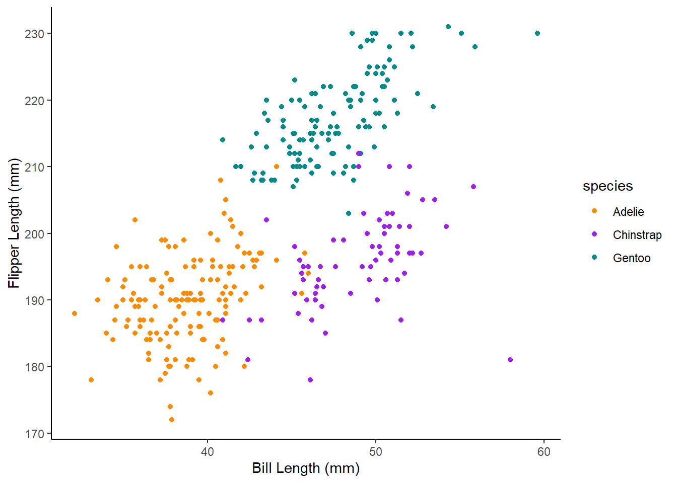
But to specify colours you need to use
scale_colour_manual.
Challenge 5 Adapt your code to add a scale_colour_manual layer with the colours darkorange, purple and cyan4 to create the graph below.
Tip: creating plots
If searching for ggplot layers that will control specific parts of your graph, using the correct graph terminology helps. For example, tick marks, levels, error bars, axes, legends.
If code is not working, try running it repeatedly without different layers in turn to identify which layer is the problem.
1.4 Plotting statistics
ggplot2 makes it easy to overlay statistical models represented by a
trend line on a graph by adding a geom_smooth layer:
ggplot(data = penguins, mapping = aes(x = bill_length_mm, y = bill_depth_mm)) +
  geom_point() +
  geom_smooth(method="lm")
Note: the lm stands for linear model and is the function
used to run a linear regression.
We can also do this after the data has been split by
species using group:
ggplot(data = penguins, mapping = aes(x = bill_length_mm, y = bill_depth_mm, group = species)) +
  geom_point() +
  geom_smooth(method="lm")
Challenge 6
Make a scatterplot of bill length and bill depth, grouped and coloured by species, with trendlines for each species and triangles for points and specify colours (you can choose colours). Give it appropriate axes labels and a classic theme.
What the Challenge 6 graph might look like
Here is one possible solution: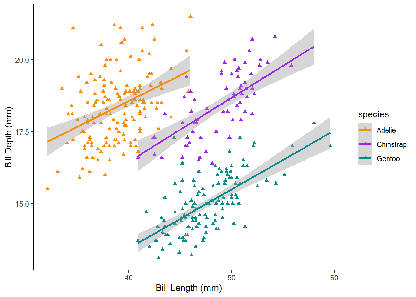
1.5 Exporting plots
The ggsave() function allows you to export a plot
created with ggplot so you can paste it into word. You can specify the
dimension and resolution of your plot by adjusting the appropriate
arguments (width, height and dpi)
to create high quality graphics for your assessments.
In order to save a plot from above, we first assign it to an object, we
could call it penguin_plot:
penguin_plot <- ggplot(data = penguins, mapping = aes(x = bill_length_mm, y = bill_depth_mm, colour = species, grouped = species)) +
  geom_point(shape = "triangle") +
  labs(x = "Bill Length (mm)",
       y = "Bill Depth (mm)") +
  theme_classic() +
  scale_colour_manual(values = c("darkorange","purple","cyan4")) +
  geom_smooth(method = lm)
Now we can tell ggsave to save that plot in our
results folder, with the file name “billScatterplot”, in
png format and specify the width and height in cm and the
resolution (dpi). Check you have a results folder in your
working directory by clicking the files tab in the bottom left pane.
ggsave(filename = "results/billScatterplot.png", plot = penguin_plot, width = 12, height = 10, dpi = 300, units = "cm")Adapted from R for Reproducible Scientific Analysis licensed CC_BY 4.0 by The Carpentries